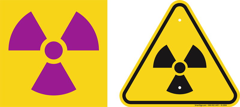
The idea for the current radiation warning symbol (the Trefoil) was developed in 1946 by a small team of scientists at the University of California Radiation Laboratory. Led by Nelson Garden, the head of the Health Chemistry Group at the Radiation Laboratory, the group designed a small solid circle with what looks like three propeller blades equally spaced around the circle.
The Japanese Battle Flag as Inspiration
he reason for their choice of symbol has remained a mystery over time. In a letter written in 1995 by Paul Frame, a doctor at Oak Ridge Institute for Science and Education, he describes his belief that the symbol takes after the Japanese battle flag, which has a circle representing the sun in the middle with rays radiating out from it, because, "after all, [the radiation warning symbol] came along within a couple of years of WWII". Others believe that it is just a variation of the many symbols used to depict radiation before that time. Some of those early symbols were very similar to this three bladed design. One had a small circle in the center and then four lightning bolts surrounding it pointing out from the center much like the propellers. Others were just small lightning bolts in a circular formation. In a letter written in 1952, Nelson Garden did describe his first thought when his group produced the idea, "a design which was supposed to represent activity radiating from an atom," though it is still unknown if this is the true reason for its development.
Not only did the group of scientists have to think of an idea for this symbol that was not supposed to be similar to anything else, but they also had to come up with a color scheme, one that would stand out to everyone.
The Color Correction
Their original idea was a magenta symbol placed on a blue background. This received criticism because many believed that the blue would not be visible enough. However, Garden said in a letter he wrote in 1948, "The use of a blue background was selected because there is very little blue color used in most of the areas where radioactive work would be carried out. "He then explained his reasoning for not using yellow, classic for a warning sign because of its easy visibility, "the very fact that . . . the high visibility yellow stands out most prominently has led to extensive use of this color and it is very common." Garden continued to press for the use of the blue background, but in 1948, majority of workers denied it, complaining that the blue faded out very quickly during the daytime and was not visible during the night.
The design was then taken to Oak Ridge National Laboratory where various color schemes were produced and tested in order to see which scheme would be the most visible at a distance of twenty feet. The color plan they finally decided on was keeping the circle and propellers magenta-with the option of making them black instead (standard for a warning sign) and changing the blue background to the classic yellow. In their tests the yellow background was clearly the most visible, ending the search for a radiation warning symbol. In the end, the workers who needed the warning symbol felt that it mattered much more to them to have their symbol be as visible as possible than to have it be an original color plan. Thus, the modern symbol emerged.
Supplementing Safety, Reducing Risk with New Symbol
The trefoil symbol did not become iconic in the public mind, even as it became ubiquitous in fields where radiation exposure is a hazard.
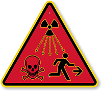
This led to calls for reform. In December 2000, at an international conference of national experts on radiation safety and security, participants noted a worldwide increase in number of deaths and serious injuries caused by exposure to International Atomic Energy Agency (IAEA) category 1, 2 (and later 3) sources of radiation. They concluded that the existing trefoil symbol was insufficient to warn individuals, such as children, who were untrained in radiation safety.
As such they recommended a new, universal warning for identifying large sources of ionizing radiation. They proposed that this warning should clearly indicate to anyone, anywhere in the world, that they must leave the object alone. The graphics should convey that one needs to "run away."
In 2001, the International Organization for Standardization (ISO) started working to develop a standard for this.
In 2005, the IAEA designed various symbols with different shapes and colors and tested its effectiveness with over 1600 people from different cultures in 11 different countries. These people had little or no technical education of radiation safety.
In 2007, the IAEA and the ISO launched the new symbol depicting radiation waves, a skull and crossbones, and a running person.
The new warning symbol for Ionizing radiation is a "supplement" and not a replacement to the Trefoil symbol.
According to a press release by the IAEA,
- The symbol should be placed on the device encasing the source of radiation to prevent a person from disassembling the device or going closer to it. The symbol will be visible only when someone dismantles it.
- It should not be placed on building access doors, shipping packages or containers.