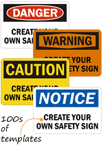
Don't Bury the Lead
There’s a reason why newspaper editors are fond of this expression, "Don’t Bury the Lead".
Labels (like a newspaper) need to grab your attention. Labels are not scholarly work – nor should they gradually build
to a conclusion to a like a good legal case or "whodunit" novel. Put the most important message first. In most cases
this is the either the statement of the hazard or a statement describing how to avoid the hazard. Depending upon the
sophistication of your audience and the immediacy of the hazard, you may change this order.
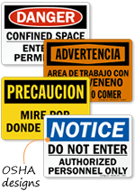
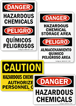
The example on the left shows the hazard first, followed by the avoidance activity. It is oriented to electricians
who are certainly more aware of the dangers of 13,200 volts and the meaning and importance of lockout procedures. The
consequences are often dropped (and already understood), given the training of this more sophisticated group.

The example on the right is oriented to an
inexperienced audience. The message is simple and direct – Keep Out! The symbol is often more literal (versus an
abstract symbol that has to be learned).
Click here to learn more about symbols.
Use Action Oriented Text that Avoids "Weasel Words"
In all cases, the headlines should be action oriented and specific. But, what does this mean? Here are some examples:
| Passive / Indirect |
Active / Action Oriented |
| When alarms are activated ammonia has been detected. |
Do Not Enter If Red Light Is On. |
| Keep your hands away from the pressure roller. |
Keep Hands Away from Roller. |
| Don't operate this device unless the incoming supply of power has been isolated. |
Lockout Power Sources Before Operating This Device. |
| Weasel Words |
Clear Instructions |
| Take note of the user manual. |
Read user manual first. |
| It is unlawful to dispense flammable materials into any metal container unless that container is approved by the Fire Marshal. |
Use approved plastic containers for disposal of flammable materials. |
| Wear Proper Attire and Follow Safety Guidelines. |
Wear goggles, gloves and apron. Consult SDS. |
| Excessive exposure to steam room can be harmful to your health. |
Maximum time is steam room is 30 minutes. Do not use if pregnant or have high blood pressure. |
Cut out prepositions. Avoid ambiguous instructions. Think like a sergeant. Get your message across simply and quickly.
Tie to Other Information.
Unless you have unlimited space or a willingness to dip down to 4pt type, warning
label designers will, eventually have to limit their text. Your legal department may revolt and demand ever larger
labels and ever smaller type (witness the tiny type you see on some children’s aspirin bottles that can barely be read
by day, let alone at night without your reading glasses and your child is screaming).
The solution is to tie your label to another source for
information. The warning label is part of a system. Don’t be afraid to use text like, “Consult Your SDS” or "Refer to
equipment manual". Another solution is to use a QR code.
Effective labels often tie back to another information source, such as a web page or manual.
Using any SmartPhone, the label can refer you to a web page or a user manual. The QR code, in a sense, means that a
detailed set of service instructions or maintenance records is just a scan away.
Black Text or White Text for Warning Labels
Which is better?
The most common design remains black text on a white
background. Similar to a newspaper and most web pages, this pattern is most familiar. You read most quickly and with
less strain, the fonts and type pattern that you see most often in daily life. The white label (on the left) provides a
larger “target” area – to catch one’s attention.
The design on the right is used when you need to highlight the text itself and have adequate lighting in
place. Reversed out letters, however, tend to fill in, especially with smaller type.
When to Use an Exclamation Point
Feel free to use an Exclamation Point ("!") on your headline – once.
While great for a single “Do This Now!” warning, there is a real danger of overuse of the "!" (e.g. the “Cry Wolf”
phenonmenon when too many warnings are issued and none are considered real). A business email should never have more
than one emoticon – similarly, your warning should only have a single exclamation point at most.
Flush Left and Lower Case Letters
Much research has been done on the superiority of lower case letters. We
recommend initial caps on your warning label headline and sentence casing for longer hazard or consequence
statements.
The other isssue is
justification – the use of centered text versus left justified text for your label.
As the warning becomes more complex, left justification (flush left text) is essential for faster comprehension.
You eye move more smoothly as you scan from line to line.
All capital letters are harder to read. Since we tend to look at the edges of
letters and the overall shape of word clumps, the lower case alphabet, in its greater detail, offers more clues to the
reader. You read word shapes, not individual letters. The ascenders and descenders of lower case letters help you better
decipher each word.